What is Mobile SEO? – Key takeaways for you
| – Mobile SEO is the practice of optimizing your website for mobile search queries and mobile users. – Mobile-first indexing by Google means that having a mobile-friendly website is crucial for ranking well in mobile search results. – Mobile SEO requires a different approach compared to desktop SEO, taking into account factors such as navigation, voice search, and local search. – Mobile optimization can be done by implementing AMP, optimizing page speed, using a responsive design, and focusing on user experience. – Mobile devices generate a significant portion of internet traffic, and mobile SEO is essential for the success of any website in today’s digital age. |
Have you ever searched for something on your phone and noticed that the results look slightly different from what you see on your laptop?
Think of it like this: you know how you might dress for a formal office dinner than you would for a casual brunch with your childhood buddies.
But mobile SEO is important for your site and there’s more than the look.
The reason behind it is mobile-first indexing by Google. Due to it, Google crawls a website via the Google Smartphone user agent.
It’s like a librarian who prioritizes cataloging and organizing books based on their newer, more updated versions instead of the older, outdated ones.
Additionally, a majority of users will try to access your website using a mobile device and they make up a growing portion of internet traffic. With mobile SEO, they will find your content easily.
In India, where a huge chunk of the population has mobiles compared to desktops and laptops.
Ready to learn more about mobile SEO, Let’s dive in!
What is Mobile SEO?
Mobile SEO is optimizing your website for mobile search queries and mobile users.
Generally, Mobile SEO focuses on on-page optimisation techniques to improve the website’s mobile search worthiness.
What’s more, if your website is already optimised for search engines, you only need to take a few additional steps while optimising it for mobile devices.
Why Does Mobile SEO Matter?
In the final quarter of 2022, mobile devices generated 59% of worldwide mobile traffic.
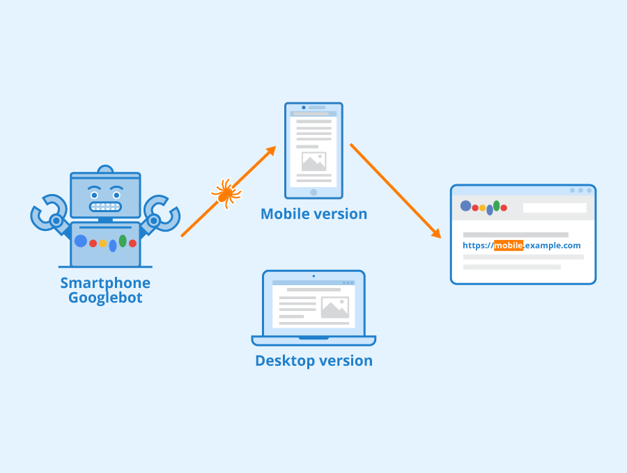
Also, in 2016, Google announced mobile-first indexing, as per which the search engine giant mainly crawls the web via the GoogleBot smartphone user agent.
Previously, the search engine Moghul had two different indexes – to crawl mobile phones it used to go to the mobile version of the website and for the desktops, it used the desktop version.
In 2018 mobile-first indexing started to roll out and now the bots go to the mobile version of the website and check how good or bad it is. Then depending on the quality of the mobile version, it indexes the desktop version of the website.
In simple terms, Google started the mobile version of the sites for indexing and ranking.
I am sure this information is enough for you to understand why mobile SEO is essential for your website’s success.
Mobile SEO vs Desktop SEO: Key Differences and Similarities
When it comes to the difference between mobile and desktop SEO the very first point that comes to your mind is the screen size.
Mobile devices have smaller screens, which means that users will be scrolling more and navigating differently compared to desktops.
This means, for mobiles, websites need to prioritize content that’s easy to read and navigate on a smaller screen and also prioritize the loading time.
Additionally, mobile SEO also takes into account factors like touch navigation, voice search, and local search, which are more prevalent on mobile devices.
Besides, mobile responsiveness is paramount for any website, since Google has made it clear that having a mobile-friendly website is crucial for ranking well in mobile search results.
This means that websites need to be designed with a responsive layout that adjusts to different screen sizes and devices.
Also, mobile SEO considers factors like app integration, mobile-specific user behavior, and mobile-specific keywords.
That said, here are the main differences between mobile and desktop SEO:
Text size
Typically, mobile text results are larger than their desktop version, since mobile focuses more on the visuals.
Search layout
The search layouts of a mobile and a desktop are different, due to which the screen space changes for both.
The mobile screen is much smaller than the desktop and it is vertical. Additionally, Google also lays out search results differently for mobiles than desktops.
Mobile shows 2-3 listings and it shows more features than a laptop or desktop.
Number of listings
While checking the SERPs, mobile users will see 2-3 listings at once and to check more results they need to swipe multiple times. Desktop on the other hand fits more than 5 text results on screen at a time
Click-through rate
The click-through rate drops significantly less on mobile than on desktop. It is because on mobiles each listing is clearly sectioned off which makes it easier for users to check individual listings. These listings also have images that make the CTR drop less significant. More so, they click seeing the glossy images and attractive videos.
On the other hand, desktops have a wider landscape-oriented screen that gives search results more space. You can see multiple listings at a time.
On mobile, CTR for the first position is 24% and for the second position 14%, while on a desktop it falls at 31%, and for the second position it is 15%.
In the case of desktops, due to the numerous listing, they go with the 1st one instead of vetting through the rest of the list.
How to Optimise for Mobile SEO: Options Available

Now, making your site mobile-friendly is not at all a hard nut to crack. In fact, it is super simple if you know these tips and tricks.
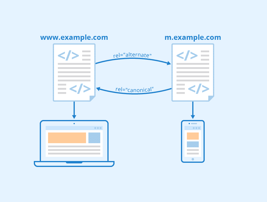
Serve a separate mobile version
If you check any website on your mobile, you will see this: m.example.com/page. Adding m. is common practice from the past.
So if it is a desktop, the structure will be example.com/page, and if it is a mobile version the structure will be m.example.com/page.
But if you ask me whether it is a good practice, I would say NO.
Why?
The biggest problem with creating different web pages of your website for mobile and desktop versions is that it will create duplicate content issues.
It is because technically the mobile version of the website and the desktop version are two different websites, at least in the eyes of the search engines.
For example, if you have noticed the mobile version of the Times of India website is m.timesofindia.com.
Side note: A subdomain is anyway considered as a separate domain by the search engines.
Besides, Googlebot may fail to interpret these signals properly and it can lead to indexation problems and duplicate content issues.
So, what can you do instead?
Implement AMP
First of all, let’s try to understand AMP and how to install it.
The AMP project originally stood for Accelerated Mobile Pages.
It is an open-source framework created to offer a user-first format for web content.
Simply put, the project was initiated keeping in mind the mobile users who do not have wifi connection all the time and to offer a super fast loading speed so that they can have access to the website anywhere any time.
But how does AMP do that?
- AMP serves stripped-down versions of web pages designed to load quickly on mobile devices.
- A lot of design restrictions ( you cannot have pop-ups, CSS needs to be under 50 KB, JS needs to be under 150 KB) were done to achieve this.
- Using the prerendering method, in which Google creates a cache of your page and serves it from your server.
Now the question is why and when you should implement AMP.
- The median load time for an AMP page is 0.7 seconds. On the other hand, as per Google, the median load time of a regular mobile page is 15 seconds.
- If you a news website, the only way of getting onto the special news panel is by implementing AMP.
Sounds great?
Now, what if I tell you, you shouldn’t implement AMP?
No, I am not contradicting my statements, and here’s why:
- You might lose out on links as you will end up linking them to the Google page.
- It can mess up your site’s analytics data
- As there are many restrictions, you might have to compromise on functionality and branding.
If you have more disadvantages than advantages with AMP, why am I talking about it?
The answer is to help you make an informed decision. Especially, when a client would like you to implement AMP as an SEO specialist, you should be able to explain why they should implement it (or not).
So, what’s the next option?
Have a responsive website
Having a responsive website is the best trick of the trade.

With a responsive website or website design your page’s layout as well as the content will respond to individual users, irrespective of what device they’re using.
The best part a responsive design serves your purpose perfectly without separate URLs and HTML for different devices.
Most WordPress themes today are responsive, and automatically make your website mobile responsive.
Here are some of the benefits of using a responsive design:
- You will be using a single URL for all your content. Which makes sharing them and getting links much easier for you.
- You can say goodbye to all your SEO worries, which means no using canonical tags and no duplicate content worries.
- The load time will be reduced since it doesn’t need redirection for users to get a device-optimized view.
- User experience is a huge part of SEO, so your website users will have an insanely user-friendly experience.
Common Mobile SEO Mistakes to Avoid
Here are some of the mobile SEO mistakes you should avoid:
Not optimizing for mobile page speed
Typically, mobile users expect websites to load quickly, and failing to optimize your website for mobile devices can result in slow load times.
Slow load time in mobile devices can happen due to many reasons, such as large image files that take a long time to load, failure to optimize code and resources for mobile devices, or using a hosting provider that doesn’t prioritize speed.
Using pop-ups that interfere with the user experience
I can understand that Pop-ups can be a useful tool for capturing leads or promoting special offers.
But at the same time, they can also be frustrating for mobile users.
How?
Pop-ups that are difficult to close or that cover important content can interfere with the user experience and result in higher bounce rates.
Not using responsive design, causing poor display on various devices
I have already talked about and emphasized using a responsive design.
Failing to use responsive design can result in poor display on mobile, leading to a poor user experience.
This can happen due to fixed-width layouts that don’t adjust to different screen sizes, or neglecting to test your website on various mobile devices and screen sizes.
Not optimizing images for mobile, leading to slow load times
Images are a crucial element of web design, but they can also be a major source of slow load times on mobile devices.
Using images that are too large or failing to optimize images for mobile devices can cause this issue.
Using Flash or other plugins that are not supported on mobile devices
Flash and other plugins are not supported on many mobile devices, which can result in a poor user experience for mobile users.
Not using schema markup for better mobile search results
Schema markup is a code that helps search engines understand the content on your website.
Failing to use schema markup can result in lower search engine rankings, and can make it more difficult for mobile users to find your website.
So don’t forget to use schema markup.
Neglecting local search optimization for mobile users
Many mobile users use their devices to search for local businesses and services.
Not optimizing your website for local search can result in lower visibility for mobile users, and you might lose opportunities for conversions.
Not testing your website on various mobile devices and screen sizes
Mobile devices come in a variety of sizes and screen resolutions, and if you don’t test your website on different devices, it can result in a poor user experience.
Testing your website on different mobile devices and using a responsive design is extremely important.
Creating mobile-friendly content:
Mobile users have different needs and preferences than desktop users, and creating mobile-friendly content can help you meet those needs.
Ever thought about that?
Here’s how you can create content, especially for mobile users.
- Create shorter paragraphs
- Using larger fonts,
- Breaking up content into smaller chunks.
By creating mobile-friendly content, you can improve the user experience and increase engagement on your website.
The Future of Mobile SEO: Trends and Predictions for Mobile Optimisation
Here are some trends and predictions for mobile optimization:
Voice search will become even more important
As more people use voice search to find what they’re looking for online, it will be increasingly important to optimize your content for voice search.
This means you need to use conversational language and natural-sounding keywords that people actually use when speaking.
More use of artificial intelligence
In the future, more AI will be used to give mobile users a better experience.
In fact, AI is used in various ways to enhance the users’ experience and optimized sites in mobile SEO.
AI-powered tools can analyze a site and offer you insights on how to optimize your site for a certain keyword, boosting its ranking in the SERPs.
AI can be used to optimize the layout and design of your website for mobile devices. Also, you will be able to personalize the content depending on browsing history and preferences.
Page speed will continue to be a critical factor
Page speed has always been important for SEO, but it’s becoming even more critical on mobile devices.
People expect pages to load quickly on their phones, and Google knows this. Make sure your site is optimized for speed.
Mobile UX will be a key differentiator
Great user experience on mobile will definitely give you an edge over your competitors.
Video content will make up a huge portion of internet traffic
On the up and up, video content is super popular already. But in the future, it will make up a huge portion of internet traffic. So, to stay ahead of your competitors you need to take advantage of this trend and optimize your site for mobile devices.
Optimize your site’s mobile searches by including video content. Use relevant keywords in the title and description.
Also, make sure the video is available on mobile-friendly platforms. You can use videos for your social media marketing campaigns on Twitter and Instagram.
Local SEO will continue to grow in importance
More and more people are using their phones to search for local businesses and services, which means that local SEO will become even more important in the future.
Make sure your site is optimized for local search by including your business’s name, address, and phone number (NAP) on your site and on local
Do not miss out on conversion opportunities using mobile SEO
I am sure that you now have a clear understanding of what mobile SEO is and why it’s so important for your business after reading this blog.
If you want to stay ahead of the game, then it’s time to take action.
Mobile SEO is an ever-evolving field, so you need to stay up-to-date with its latest trends and techniques.
Don’t forget to keep an eye on your analytics, experiment with new approaches, and continuously refine your mobile SEO strategy to stay ahead of the curve.
Armed with the knowledge of mobile SEO, you can now put it into action.
So, what are you waiting for? Get started on optimizing your website for mobile devices today and watch your traffic and conversions soar!
If you have further queries on mobile SEO, let me know in the comments.
FAQs
What is a mobile-first strategy?
Mobile-first strategy refers to strategies for developing websites in which the mobile-enabled version of the website is given priority over its desktop version.
What are the unique considerations for mobile SEO?
Here are some unique considerations for mobile SEO:
– Target voice search-friendly keywords
– Create content that is mobile friendly
– For better user experience, optimize mobile site speed
– Use mobile-friendly keywords in the title tag and meta description. Optimize them for mobile SERPs.
– On your mobile site, use structured data